by Maria Baleva | Sep 28, 2025 | Blog
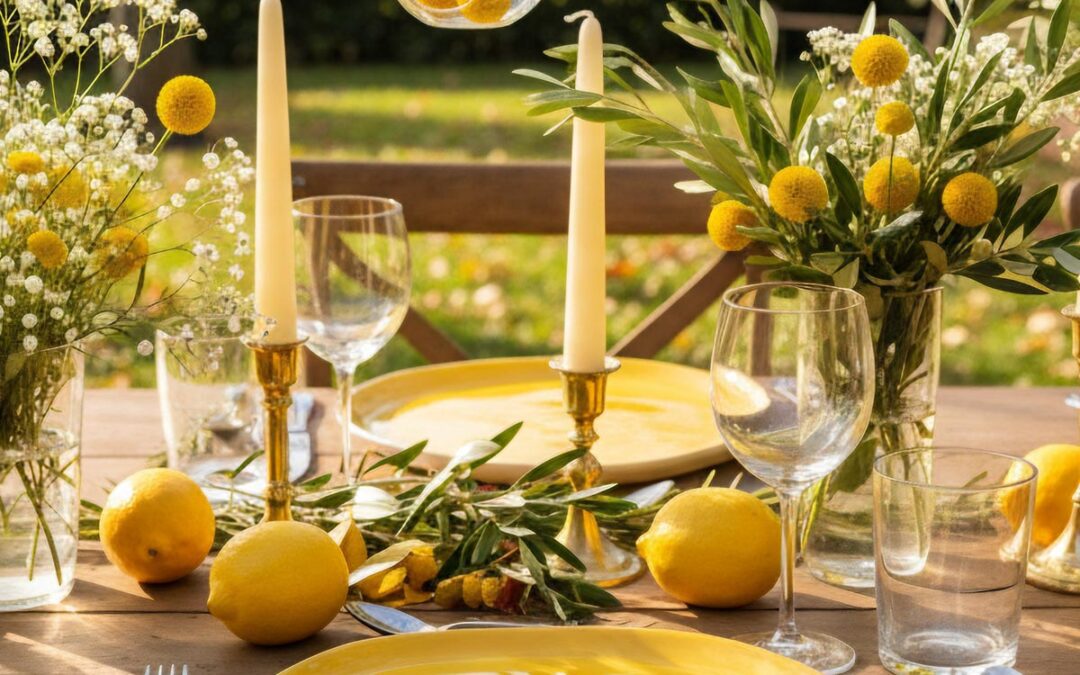
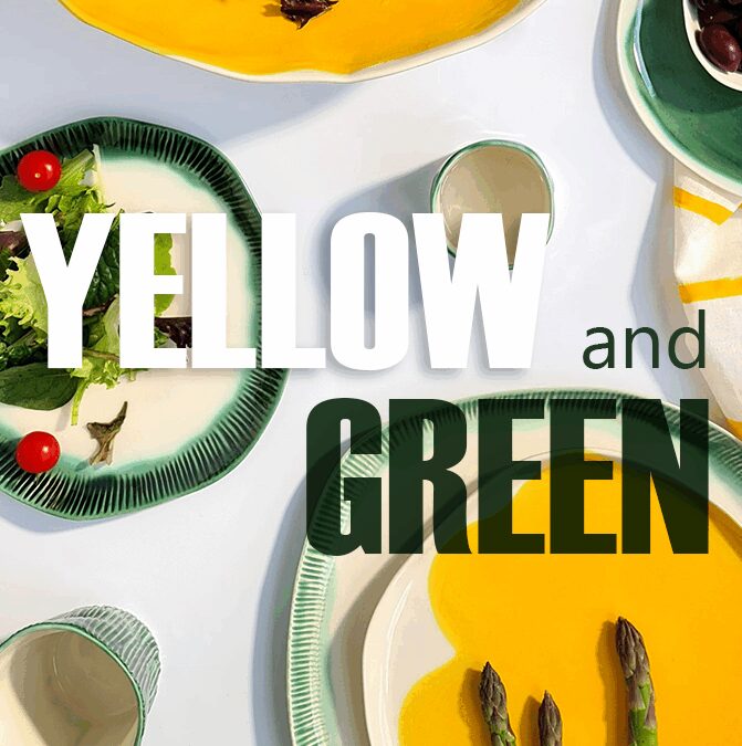
There’s one color that has the power to change how we gather. There’s one color that has the power to change how we gather. We’ve seen it stretch family dinners by 20 minutes, spark easier conversation, and shift the whole mood of a table. That color is Cadmium...
by Maria Baleva | Sep 13, 2025 | Blog
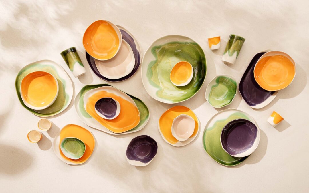
Van Gogh - Arles View from the Wheat Fields 1888 Color Psychology at the Table Autumn colors feel right because our eyes adapt to the warmer light spectrum of the season. The lower sun fills our days with golden tones, making deep purples, aubergines, and ochres feel...
by Maria Baleva | Aug 25, 2025 | Blog
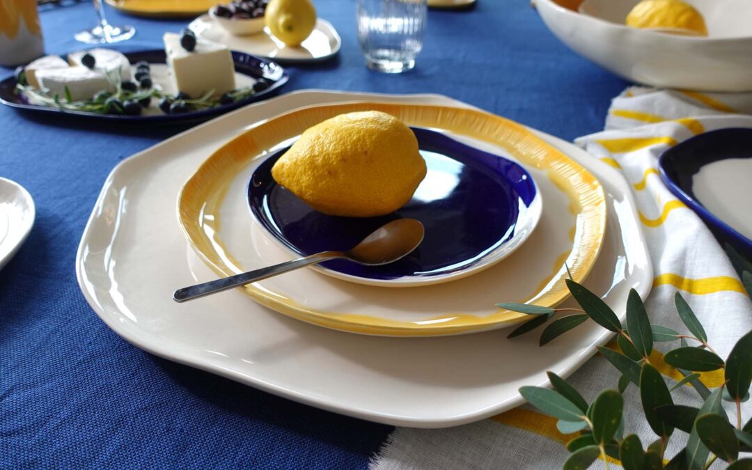
Set a Table That Speaks RoyaltyHandmade cobalt-blue porcelain – centuries of heritage, elegance reborn for modern living. For those who believe dining is an art, not an afterthought. Is there a color palette and pattern that has graced palaces across the world for...
by Maria Baleva | Aug 17, 2025 | Blog
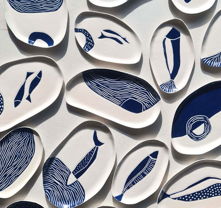
You will never believe how old this is. The lines you see on a Pottery & Poetry plate today — playful, carved, and filled with color — have roots that go back more than 7,000 years. Long before porcelain, before glass, before most of what we call “design”...
by Maria Baleva | Aug 11, 2025 | Blog
Curate your set Discover the Perfect Summer Combination Through an Architect's Eye As summer unfolds its golden warmth, the accomplished woman knows that her table should reflect both the season’s vibrancy and her own refined sensibilities. After 18 years of...