Why we're choosing evolution over disruption
In an industry that often chases the next trend, we’re taking a different approach for 2026. Our color strategy centers on continuity, not seasonal disruption or novelty for its own sake.
We’ve built two color palettes: Spring-Summer and Autumn-Winter – that don’t just coexist, they’re designed to live together. This means the pieces you bring into your home in spring won’t feel out of place when autumn arrives. They’ll simply be enriched by the deeper tones that join them.
The foundation: Pantone’s Cloud Dancer
At the heart of both palettes is Cloud Dancer (#F3F2EE), a warm, porcelain-like off-white that serves as more than just a background. A foundation – a surface that absorbs light, softens contrast, and allows every other color to exist without visual tension.
This goes beyond stark white. A nuanced base that feels lived-in from the start, the kind of color that makes a space feel warm rather than clinical, inhabited rather than staged.


Spring-Summer 2026: Fresh, expressive, optimistic
The Spring-Summer palette brings energy without excess. These colors are vivid but anchored, bright but never fleeting.
- Electric Matcha (#9BC43A) leads with contemporary confidence – a vibrant green that references food, nature, and renewal while remaining distinctly modern. It’s fresh without being saccharine, bold without being loud.
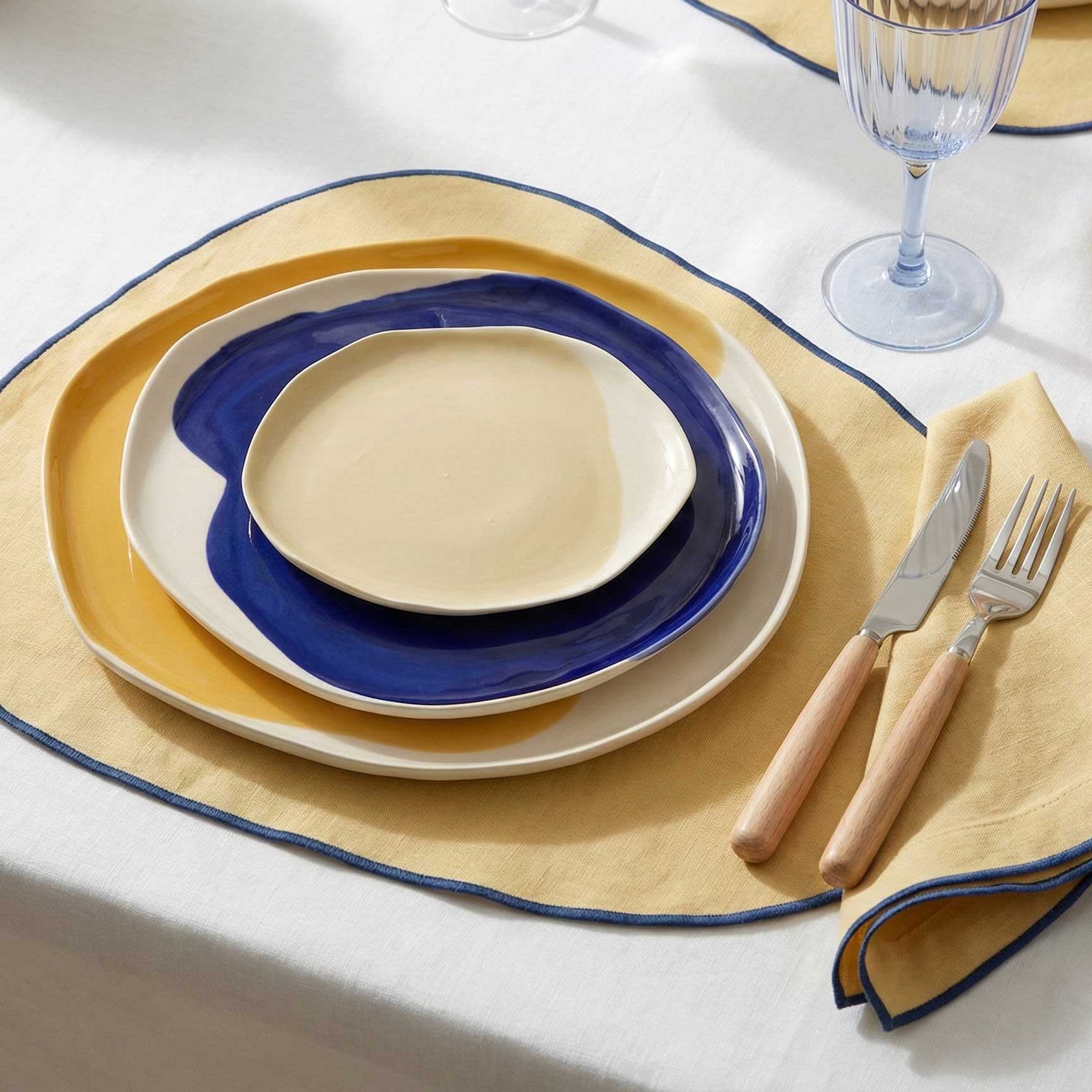
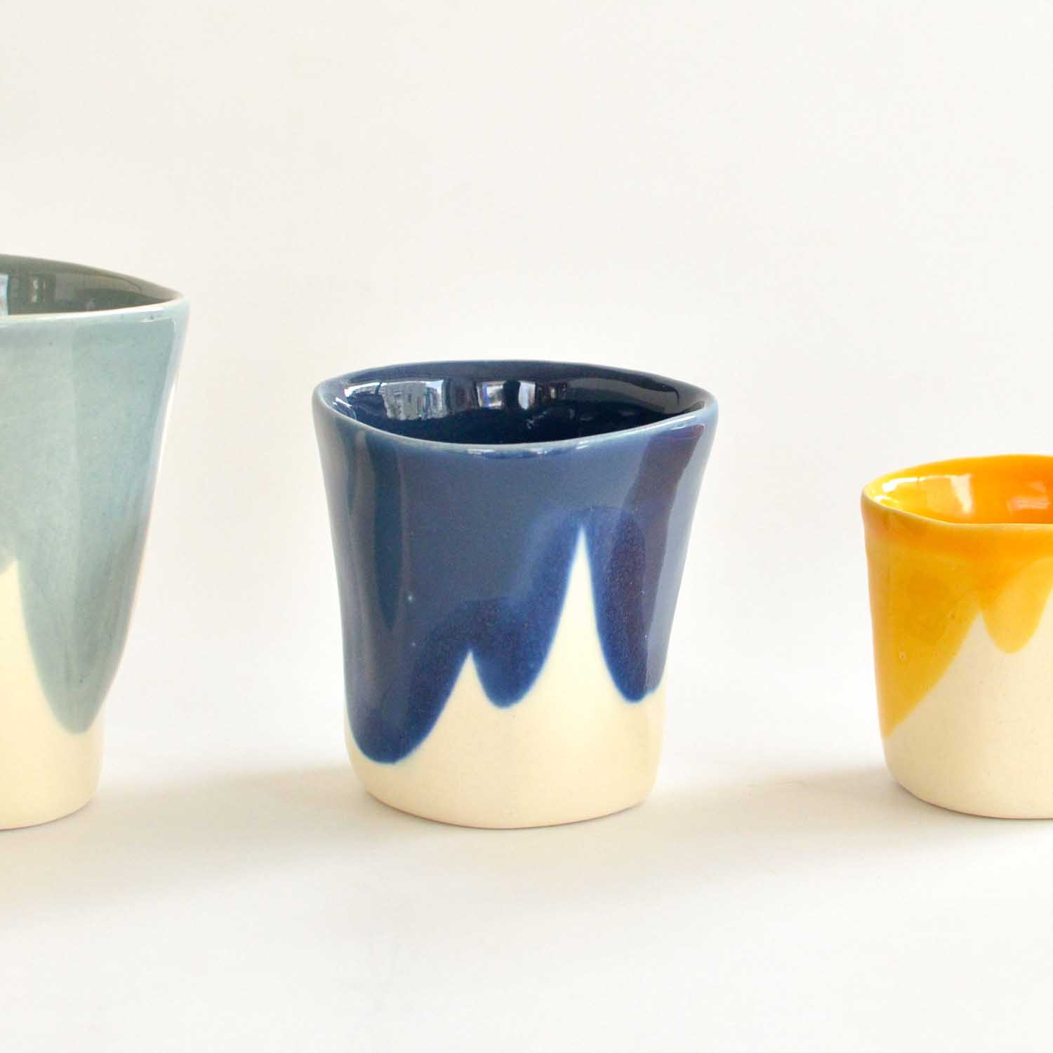
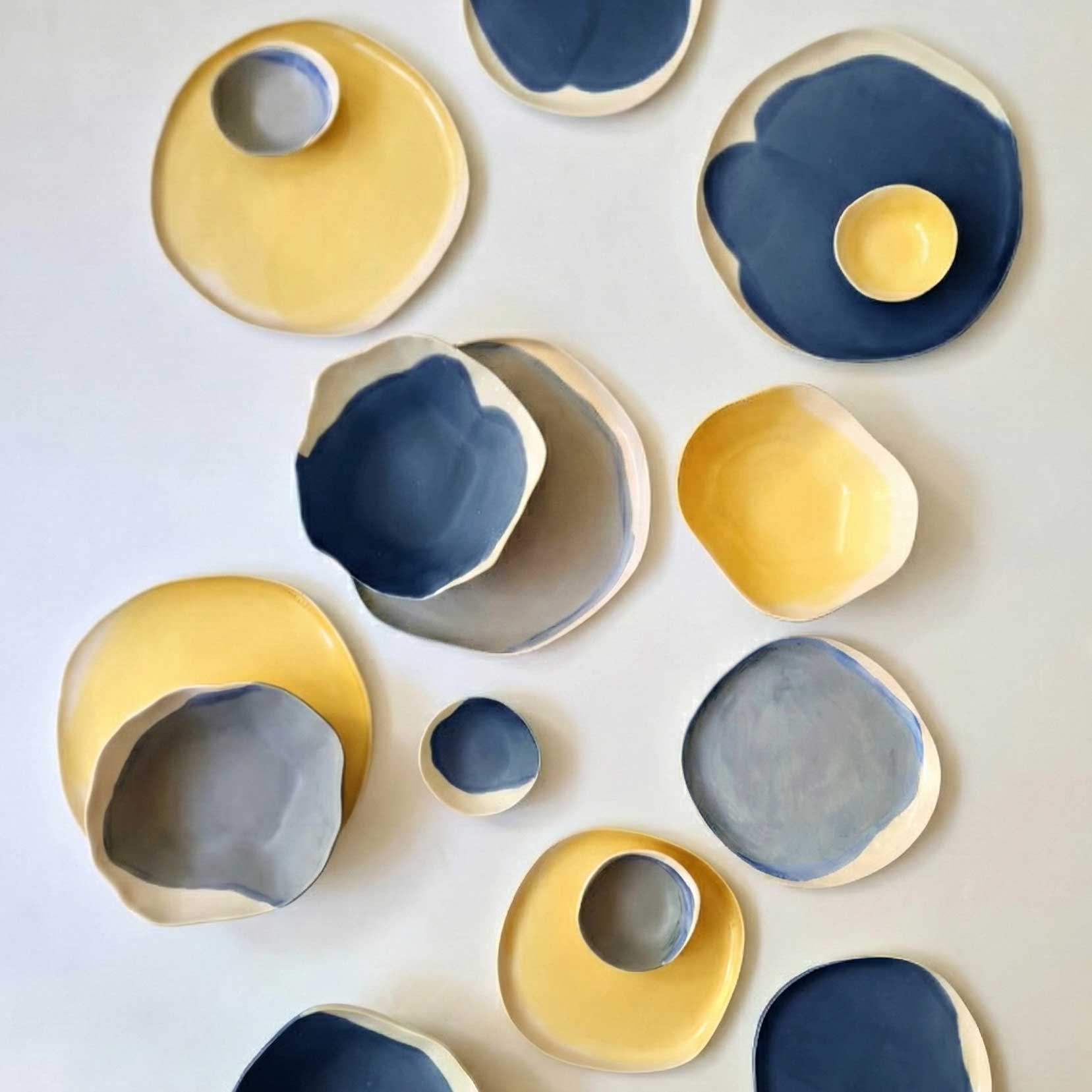
- Lemon Yellow (#F1E04B) brings luminosity as an accent, echoing citrus and daylight.
- Coral Red (#C94A3A) grounds the palette with its warm, earthy depth -less decorative than classic red, it references clay and terra cotta.
- Blush Pink (#E2B3BC) adds softness and intimacy, balancing the stronger tones.
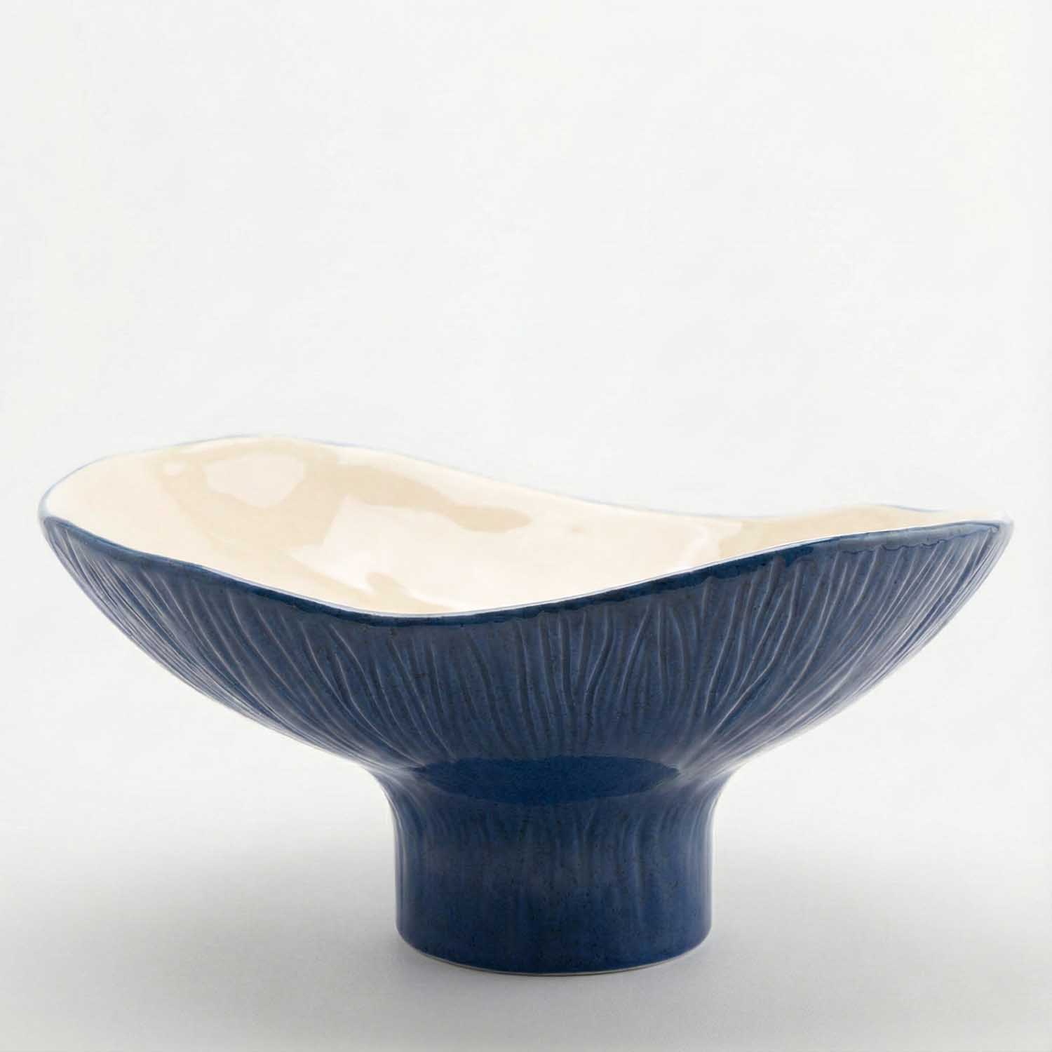
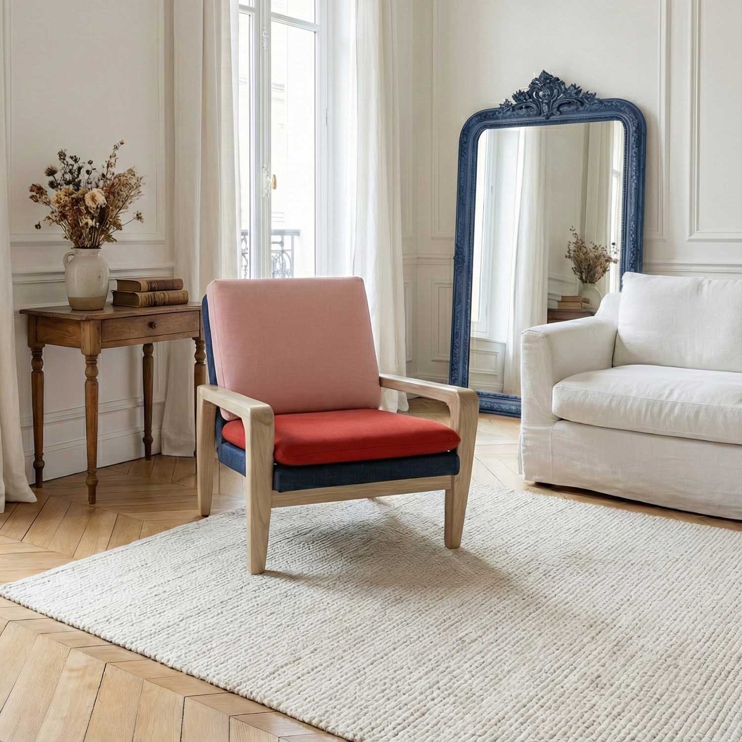
- Then there’s Denim Blue (#1F2F4A), the deep, intelligent anchor that prevents the lighter colors from becoming too playful.
- Paired with Light Denim Blue (#9FB3C8), the palette gains both structure and air—like washed textiles, sky, and water.
Together, these colors create optimism with restraint. They feel contemporary now, yet familiar enough to remain relevant for years.
Autumn-Winter 2026: Muted, warm, grounded
As the year deepens, the palette doesn’t change its language – it shifts its tone. Autumn-Winter isn’t about darkness; it’s about warmth, density, and material presence.
- Indian Yellow (#D39A2C) replaces brightness with historical depth -an earthy, ochre-toned yellow with maturity.
- Butter Yellow (#E6D3A3) offers a softer alternative, calm and elegant.
- Mocha (#A47864) brings tactile warmth, evoking clay, wood, and cocoa.
- Stone Grey (#B9BEB8) acts as a mineral mediator between warm and cool.
And here’s where continuity reveals itself: Denim Blue and Light Denim Blue return, now used more sparingly to introduce structure and lightness into the deeper palette.
Milk White (#F1EDE4) replaces Cloud Dancer as a warmer interpretation, maintaining brightness while enhancing comfort.
This palette feels quiet, enduring, designed for slower rhythms and spaces meant to be inhabited.


The beauty of overlap
The strength of this system lies in its shared DNA. Key colors exist across both seasons, which means your spring pieces don’t need to be packed away when autumn arrives.
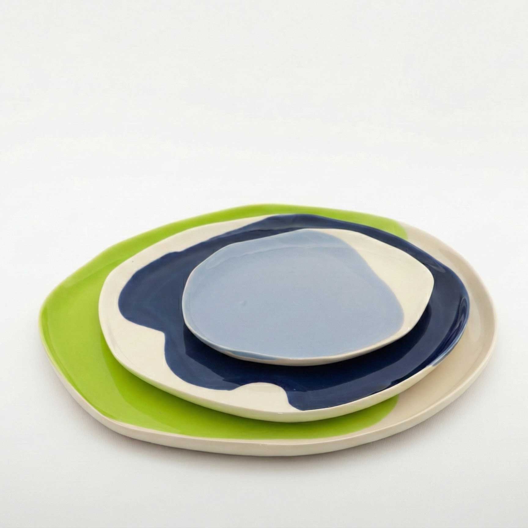
A bowl in Electric Matcha or Lemon Yellow becomes a deliberate accent when surrounded by Mocha, Stone Grey, and Indian Yellow. Nothing feels out of place – only enriched by contrast. Your table evolves rather than resets.
This is intentional design that respects how people actually live: gradually, with pieces collected over time, not replaced en masse with each season.
Why these colors work and why they'll last
Our palettes align with broader international color research for 2026, which consistently points toward warm off-whites instead of stark whites, yellows evolving from bright to ochre and butter tones, blues ranging from washed pastels to deep inky anchors, and a renewed emphasis on earth, food, and materiality.
But what keeps them in the safe zone for longevity goes beyond trend alignment. How the colors are chosen matters:
- None are extreme or synthetic
- Each has a natural, material reference
- Transitions happen within the same color families, not through abrupt contrast
This allows the collection to feel contemporary today while remaining desirable for years to come.
Color as philosophy
Our 2026 color system is not about seasons replacing one another. Colors evolve, deepen, and coexist – allowing every piece to remain part of a larger, coherent whole.
In a world that often feels fragmented and disposable, we’re choosing continuity. We’re designing for homes that grow and change gradually, where new pieces enhance rather than replace, where color brings harmony rather than disruption.
* All new colors will be available to order in January 2026.
** On January 10th, we’ll dive deeper into these colors with inspiration from fashion, table linens, and practical tips on how to combine them in your space.

Our Picks: Spring - Summer 2026
7 pieces sushi set
cake stand electric matcha color
lemon yellow signature set
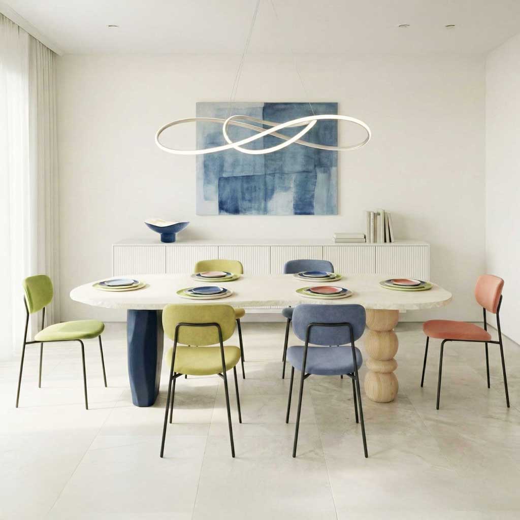
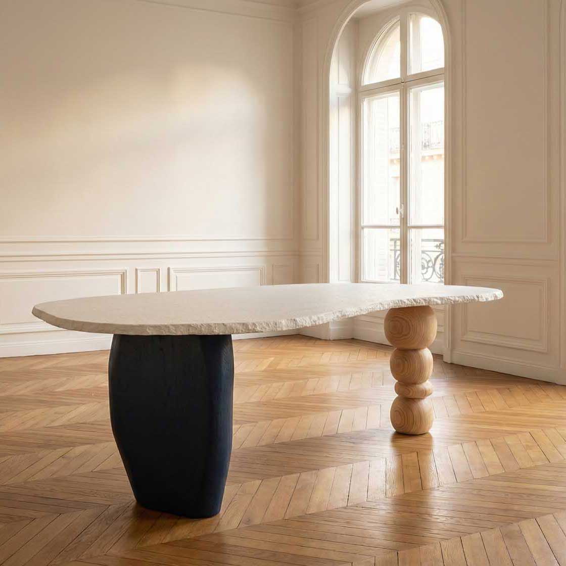
&HUE design table
(coming soon)
multiuse bowl
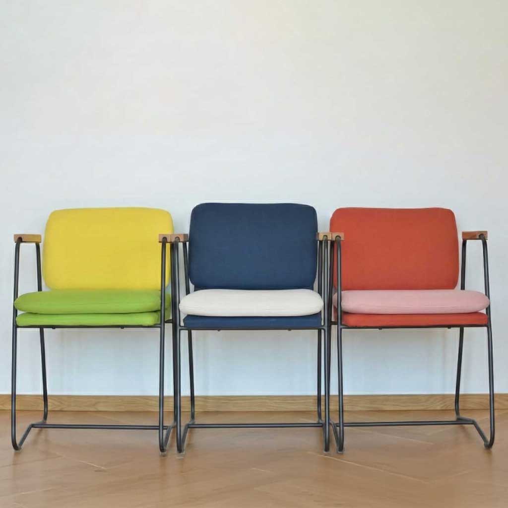
chairs &HUE
dinnerware set for 6
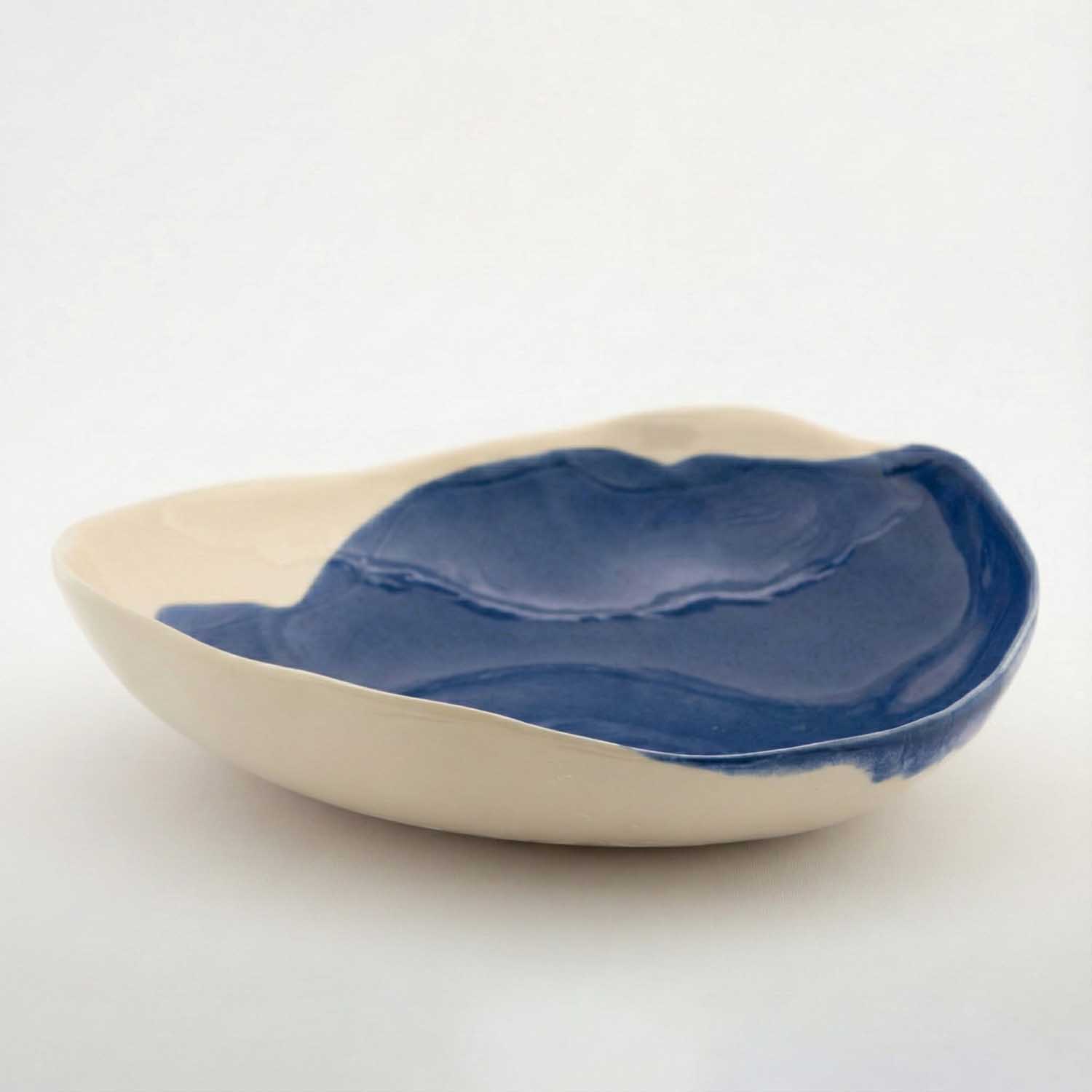
Porcelain serving bowl in dark denim
arch. Maria Baleva brings 18 years of architectural and interior design expertise to every handcrafted piece at Pottery & Poetry, where form meets function in celebration of sophisticated living.